はじめにPlotlyの特徴を簡単に紹介します。
メリットとして5つの特徴があります。
①グラフの種類が豊富
②グラフを自由自在に動かせる
⇒本記事で紹介するグラフもすべて拡大したり軸を動かしたりできる
★マップは3Dで動かせます(驚愕・・・)
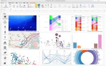
③グラフの整列・重ね合わせが超絶楽
⇒デフォルトで綺麗に整列される
④Python対応でコードがシンプル
⇒本サイトでは多種類の例文を紹介しています(最後にURL紹介あり)
⑤Excelでも使える(今後注目!!)
⇒今は限定的な使用、使い方も最後に紹介します
それではさっそくスタイリッシュなグラフを紹介していきます。
※今回紹介するグラフのPythonコードは公式サイトから引用しました。
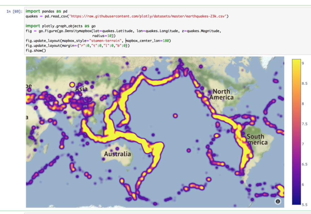
世界地図とヒートマップ(地震のマグニチュード)
世界地図にプロットができています。
マグニチュードの大きさごとで色分けされます。
このグラフは拡大・縮小が自在にでき、360度回転も可能です。
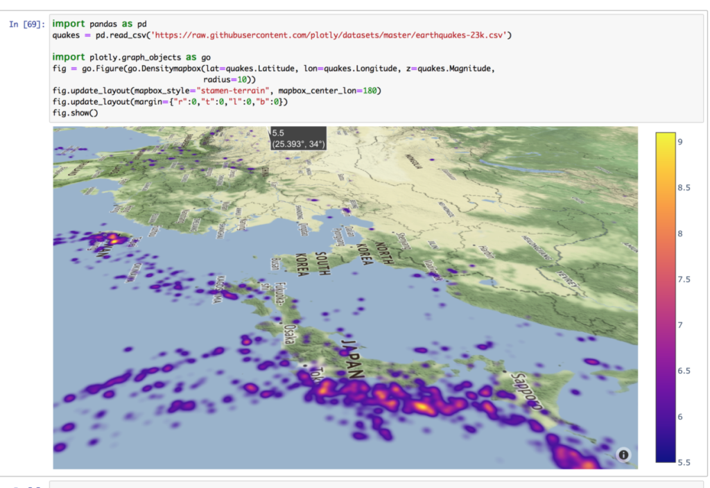
日本にズームしてみました。
せっかくなので回転もさせています。
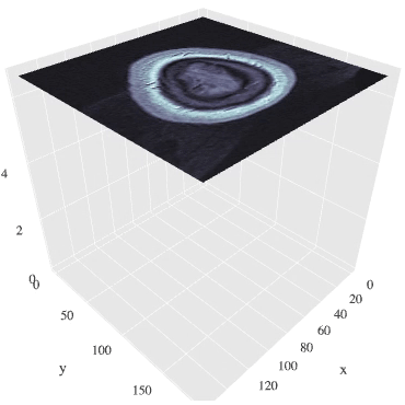
MRI画像(断面画像に分けて表示あり)
断面ごとにデータがあるため、
階層順に流動的に観察することができます。
※データが重いので画像表示まで少々時間かかります。
# Import data
import time
import numpy as np

from skimage import io

vol = io.imread("https://s3.amazonaws.com/assets.datacamp.com/blog_assets/attention-mri.tif")
volume = vol.T
r, c = volume[0].shape

# Define frames
import plotly.graph_objects as go
nb_frames = 68

fig = go.Figure(frames=[go.Frame(data=go.Surface(
    z=(6.7 - k * 0.1) * np.ones((r, c)),
    surfacecolor=np.flipud(volume[67 - k]),
    cmin=0, cmax=200
    ),
    name=str(k) # you need to name the frame for the animation to behave properly
    )
    for k in range(nb_frames)])

# Add data to be displayed before animation starts
fig.add_trace(go.Surface(
    z=6.7 * np.ones((r, c)),
    surfacecolor=np.flipud(volume[67]),
    colorscale='Gray',
    cmin=0, cmax=200,
    colorbar=dict(thickness=20, ticklen=4)
    ))


def frame_args(duration):
    return {
            "frame": {"duration": duration},
            "mode": "immediate",
            "fromcurrent": True,
            "transition": {"duration": duration, "easing": "linear"},
        }

sliders = [
            {
                "pad": {"b": 10, "t": 60},
                "len": 0.9,
                "x": 0.1,
                "y": 0,
                "steps": [
                    {
                        "args": [[f.name], frame_args(0)],
                        "label": str(k),
                        "method": "animate",
                    }
                    for k, f in enumerate(fig.frames)
                ],
            }
        ]

# Layout
fig.update_layout(
         title='Slices in volumetric data',
         width=600,
         height=600,
         scene=dict(
                    zaxis=dict(range=[-0.1, 6.8], autorange=False),
                    aspectratio=dict(x=1, y=1, z=1),
                    ),
         updatemenus = [
            {
                "buttons": [
                    {
                        "args": [None, frame_args(50)],
                        "label": "▶", # play symbol
                        "method": "animate",
                    },
                    {
                        "args": [[None], frame_args(0)],
                        "label": "◼", # pause symbol
                        "method": "animate",
                    },
                ],
                "direction": "left",
                "pad": {"r": 10, "t": 70},
                "type": "buttons",
                "x": 0.1,
                "y": 0,
            }
         ],
         sliders=sliders
)

fig.show()
いろいろなMIXグラフ
これ一つで資料一枚分作ることができます。
日常管理でデータのフォーマットが変わらなければ、更新するだけで
グラフ化できるので作業効率化になります。
好みの仕様にカスタマイズして生産性を向上させましょう。
import plotly.graph_objects as go
from plotly.subplots import make_subplots
import pandas as pd
# read in volcano database data
df = pd.read_csv(
"https://raw.githubusercontent.com/plotly/datasets/master/volcano_db.csv",
encoding="iso-8859-1",
)
# frequency of Country
freq = df
freq = freq.Country.value_counts().reset_index().rename(columns={"index": "x"})
# read in 3d volcano surface data
df_v = pd.read_csv("https://raw.githubusercontent.com/plotly/datasets/master/volcano.csv")
# Initialize figure with subplots
fig = make_subplots(
rows=2, cols=2,
column_widths=[0.6, 0.4],
row_heights=[0.4, 0.6],
specs=[[{"type": "scattergeo", "rowspan": 2}, {"type": "bar"}],
[ None , {"type": "surface"}]])
# Add scattergeo globe map of volcano locations
fig.add_trace(
go.Scattergeo(lat=df["Latitude"],
lon=df["Longitude"],
mode="markers",
hoverinfo="text",
showlegend=False,
marker=dict(color="crimson", size=4, opacity=0.8)),
row=1, col=1
)
# Add locations bar chart
fig.add_trace(
go.Bar(x=freq["x"][0:10],y=freq["Country"][0:10], marker=dict(color="crimson"), showlegend=False),
row=1, col=2
)
# Add 3d surface of volcano
fig.add_trace(
go.Surface(z=df_v.values.tolist(), showscale=False),
row=2, col=2
)
# Update geo subplot properties
fig.update_geos(
projection_type="orthographic",
landcolor="white",
oceancolor="MidnightBlue",
showocean=True,
lakecolor="LightBlue"
)
# Rotate x-axis labels
fig.update_xaxes(tickangle=45)
# Set theme, margin, and annotation in layout
fig.update_layout(
template="plotly_dark",
margin=dict(r=10, t=25, b=40, l=60),
annotations=[
dict(
text="Source: NOAA",
showarrow=False,
xref="paper",
yref="paper",
x=0,
y=0)
]
)
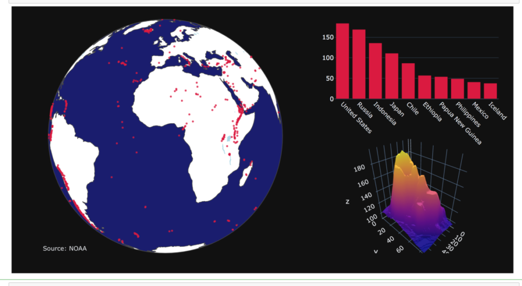
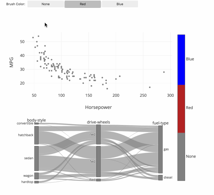
fig.show()カテゴリー分類(フルカラーの関連図)
関連図上をマウスで動かしながらカテゴリー分類ができます。
それぞれのグループの関連性がフルカラーで分かり、
今までにない発見ができることが期待できます。
最近流行りのビックデータや機会学習のような技術と相性が良いと考えられます。
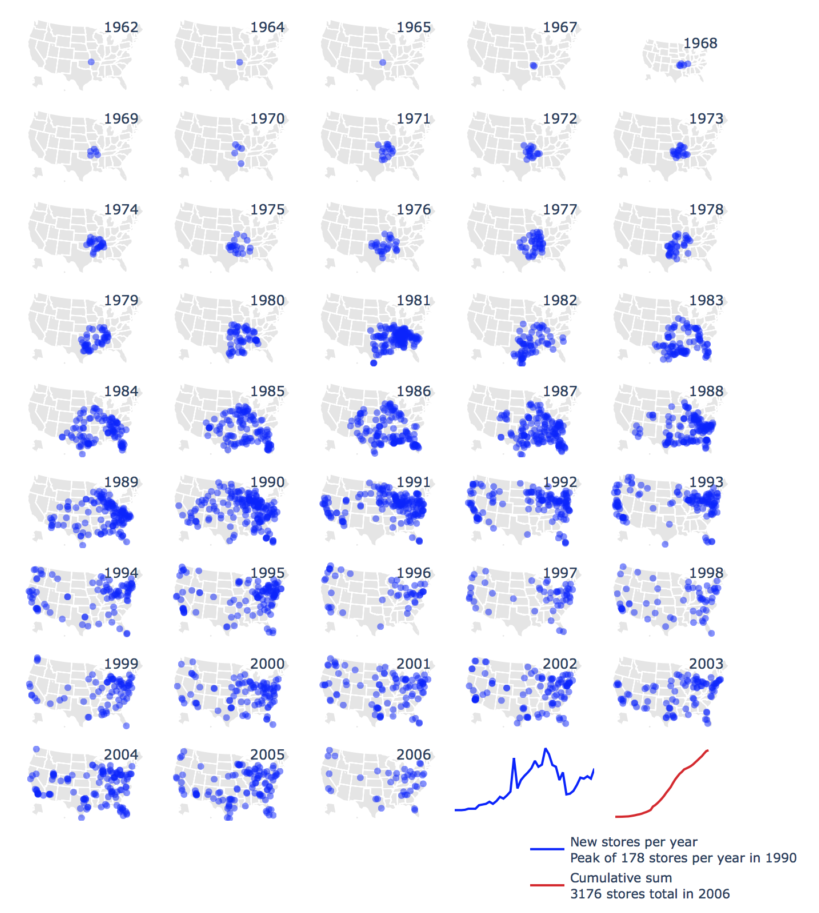
地図プロットの年代別推移(ウォルマートの店舗数)
ここまでで、何でもできることが「充分」分かっていただけたかと思いますが、
こんなこともできます。
import plotly.graph_objects as go
import pandas as pd
df = pd.read_csv('https://raw.githubusercontent.com/plotly/datasets/master/1962_2006_walmart_store_openings.csv')
df.head()
data = []
layout = dict(
title = 'New Walmart Stores per year 1962-2006<br>\
Source: <a href="http://www.econ.umn.edu/~holmes/data/WalMart/index.html">\
University of Minnesota</a>',
# showlegend = False,
autosize = False,
width = 1000,
height = 900,
hovermode = False,
legend = dict(
x=0.7,
y=-0.1,
bgcolor="rgba(255, 255, 255, 0)",
font = dict( size=11 ),
)
)
years = df['YEAR'].unique()
for i in range(len(years)):
geo_key = 'geo'+str(i+1) if i != 0 else 'geo'
lons = list(df[ df['YEAR'] == years[i] ]['LON'])
lats = list(df[ df['YEAR'] == years[i] ]['LAT'])
# Walmart store data
data.append(
dict(
type = 'scattergeo',
showlegend=False,
lon = lons,
lat = lats,
geo = geo_key,
name = int(years[i]),
marker = dict(
color = "rgb(0, 0, 255)",
opacity = 0.5
)
)
)
# Year markers
data.append(
dict(
type = 'scattergeo',
showlegend = False,
lon = [-78],
lat = [47],
geo = geo_key,
text = [years[i]],
mode = 'text',
)
)
layout[geo_key] = dict(
scope = 'usa',
showland = True,
landcolor = 'rgb(229, 229, 229)',
showcountries = False,
domain = dict( x = [], y = [] ),
subunitcolor = "rgb(255, 255, 255)",
)
def draw_sparkline( domain, lataxis, lonaxis ):
''' Returns a sparkline layout object for geo coordinates '''
return dict(
showland = False,
showframe = False,
showcountries = False,
showcoastlines = False,
domain = domain,
lataxis = lataxis,
lonaxis = lonaxis,
bgcolor = 'rgba(255,200,200,0.0)'
)
# Stores per year sparkline
layout['geo44'] = draw_sparkline({'x':[0.6,0.8], 'y':[0,0.15]}, \
{'range':[-5.0, 30.0]}, {'range':[0.0, 40.0]} )
data.append(
dict(
type = 'scattergeo',
mode = 'lines',
lat = list(df.groupby(by=['YEAR']).count()['storenum']/1e1),
lon = list(range(len(df.groupby(by=['YEAR']).count()['storenum']/1e1))),
line = dict( color = "rgb(0, 0, 255)" ),
name = "New stores per year<br>Peak of 178 stores per year in 1990",
geo = 'geo44',
)
)
# Cumulative sum sparkline
layout['geo45'] = draw_sparkline({'x':[0.8,1], 'y':[0,0.15]}, \
{'range':[-5.0, 50.0]}, {'range':[0.0, 50.0]} )
data.append(
dict(
type = 'scattergeo',
mode = 'lines',
lat = list(df.groupby(by=['YEAR']).count().cumsum()['storenum']/1e2),
lon = list(range(len(df.groupby(by=['YEAR']).count()['storenum']/1e1))),
line = dict( color = "rgb(214, 39, 40)" ),
name ="Cumulative sum<br>3176 stores total in 2006",
geo = 'geo45',
)
)
z = 0
COLS = 5
ROWS = 9
for y in reversed(range(ROWS)):
for x in range(COLS):
geo_key = 'geo'+str(z+1) if z != 0 else 'geo'
layout[geo_key]['domain']['x'] = [float(x)/float(COLS), float(x+1)/float(COLS)]
layout[geo_key]['domain']['y'] = [float(y)/float(ROWS), float(y+1)/float(ROWS)]
z=z+1
if z > 42:
break
fig = go.Figure(data=data, layout=layout)
fig.update_layout(width=800)
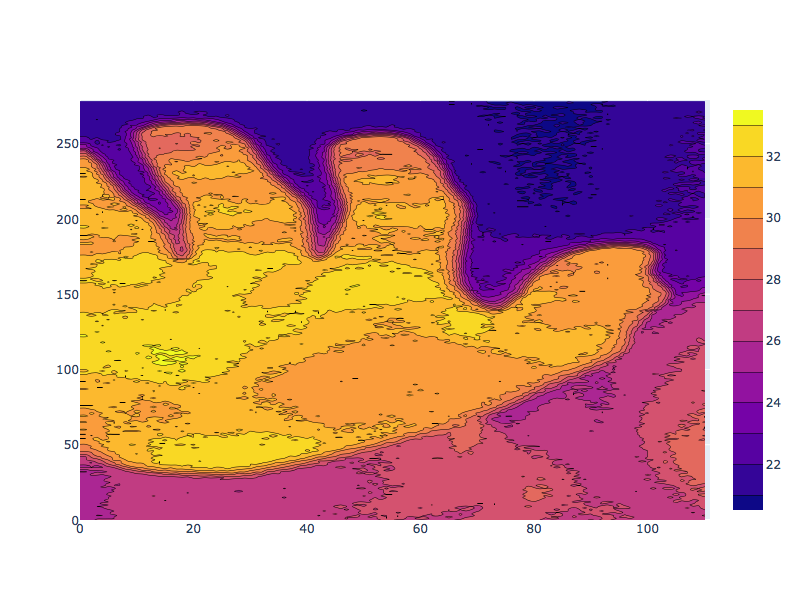
fig.show()写真とその輝度値をヒストグラムで表示
グラフ化というよりはデータ解析で使えるプロットです。
そこらの画像処理ソフトのようなことができます。
これで無料とはPlotly恐るべしです。
from plotly.subplots import make_subplots
from skimage import data
img = data.chelsea()
fig = make_subplots(1, 2)
# We use go.Image because subplots require traces, whereas px functions return a figure
fig.add_trace(go.Image(z=img), 1, 1)
for channel, color in enumerate(['red', 'green', 'blue']):
    fig.add_trace(go.Histogram(x=img[..., channel].ravel(), opacity=0.5,
                               marker_color=color, name='%s channel' %color), 1, 2)
fig.update_layout(height=400)
fig.show()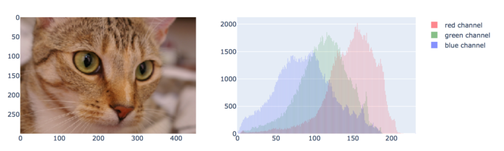
plotlyを1から学ぶためのおすすめ記事


例文の記事紹介

Excelで使う方法を紹介