本記事では日本における世界各国からのコーヒー豆の輸入金額・輸入量についてまとめました。
データは財務省貿易統計から取得したものです。
財務省で扱っている検索で必要となるコーヒーの品名コードについてはこちらに載っているので興味のある方はどうぞ
表の作成(国別輸入金額まとめ)
import plotly.graph_objects as go
import pandas as pd
df = pd.read_csv('19-coffee-R.csv')
df=df.sort_values(by='count',ascending=True)
fig = go.Figure(data=go.Bar(x=df['country'], y=df['count']))
fig.update_layout(
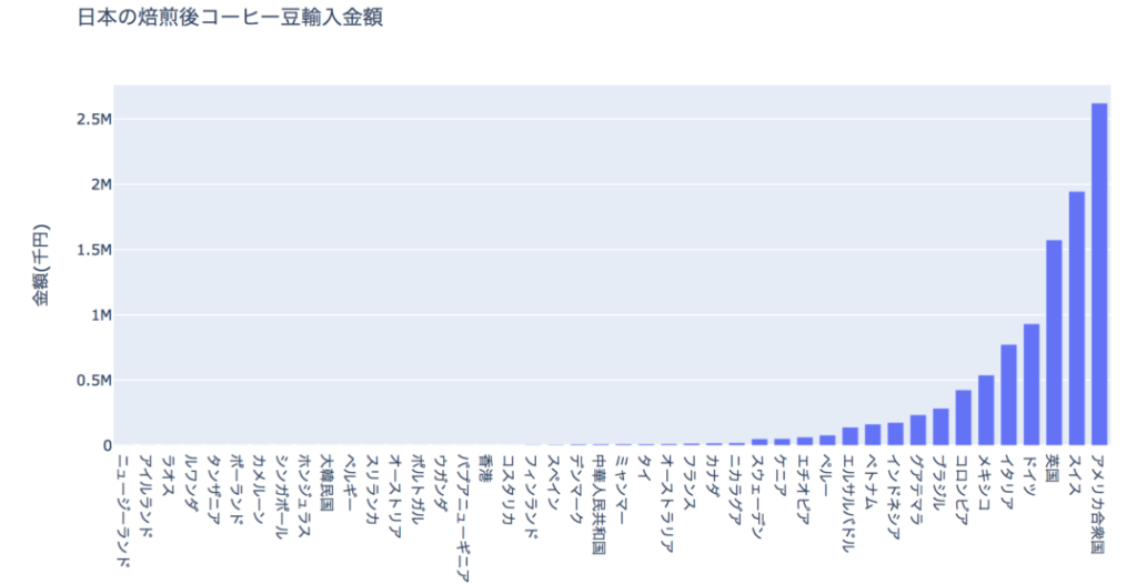
title_text='日本の焙煎後コーヒー豆輸入量',
yaxis_title_text='数量(kg)',
bargap=0.2, #隣接する位置座標のバー間のギャップ
bargroupgap=0.1 # 同じ位置座標のバー間のギャップ
)
fig.show()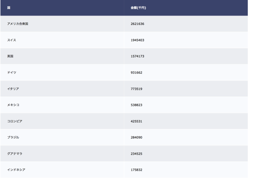
<<おまけ(棒グラフ)>>
棒グラフの作成(国別輸入数量まとめ)
import plotly.graph_objects as go
import pandas as pd

df = pd.read_csv('19-coffee-R.csv')
df=df.sort_values(by='count',ascending=True)
fig = go.Figure(data=go.Bar(x=df['country'], y=df['count']))
fig.update_layout(
    title_text='日本の焙煎後コーヒー豆輸入量',
    yaxis_title_text='数量(kg)',
    bargap=0.2, #隣接する位置座標のバー間のギャップ
    bargroupgap=0.1 # 同じ位置座標のバー間のギャップ
)
fig.show()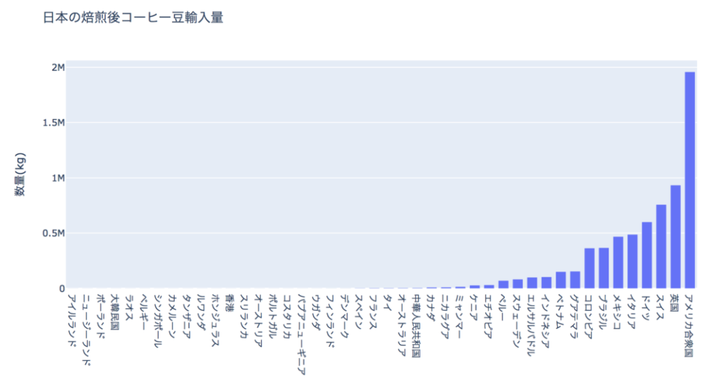
<<おまけ(表)>>
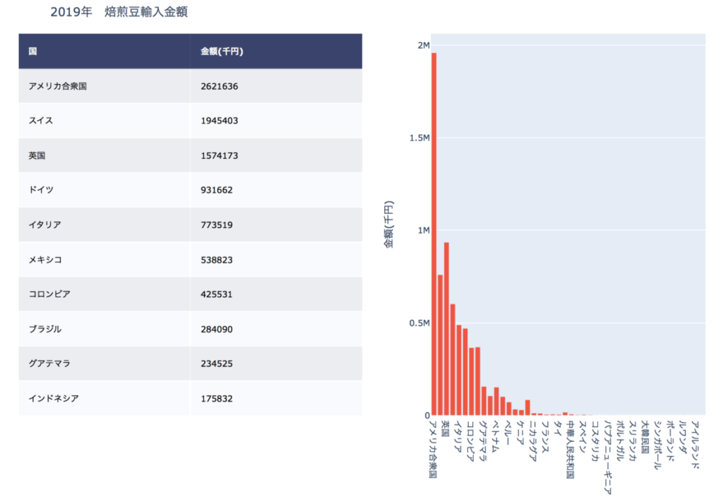
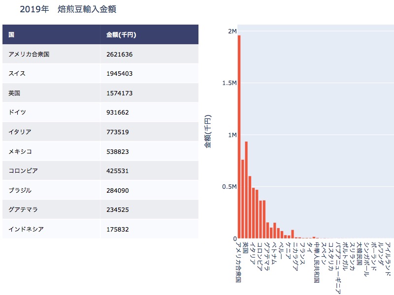
棒グラフと表を並べて整列する
import plotly.figure_factory as ff
import plotly.graph_objects as go
import pandas as pd
import numpy as np
from plotly.subplots import make_subplots
df = pd.read_csv('19-coffee-R.csv')
df=df.sort_values(by='money',ascending=False)
trace1=go.Bar(x=df['country'], y=df['count'],xaxis='x2', yaxis='y2')
df=df.drop("1", axis=1)
df=df.drop("2", axis=1)
df=df.drop("3", axis=1)
df=df.drop("4", axis=1)
df=df.drop("5", axis=1)
df=df.drop("6", axis=1)
df=df.drop("7", axis=1)
df=df.drop("8", axis=1)
df=df.drop("count", axis=1)
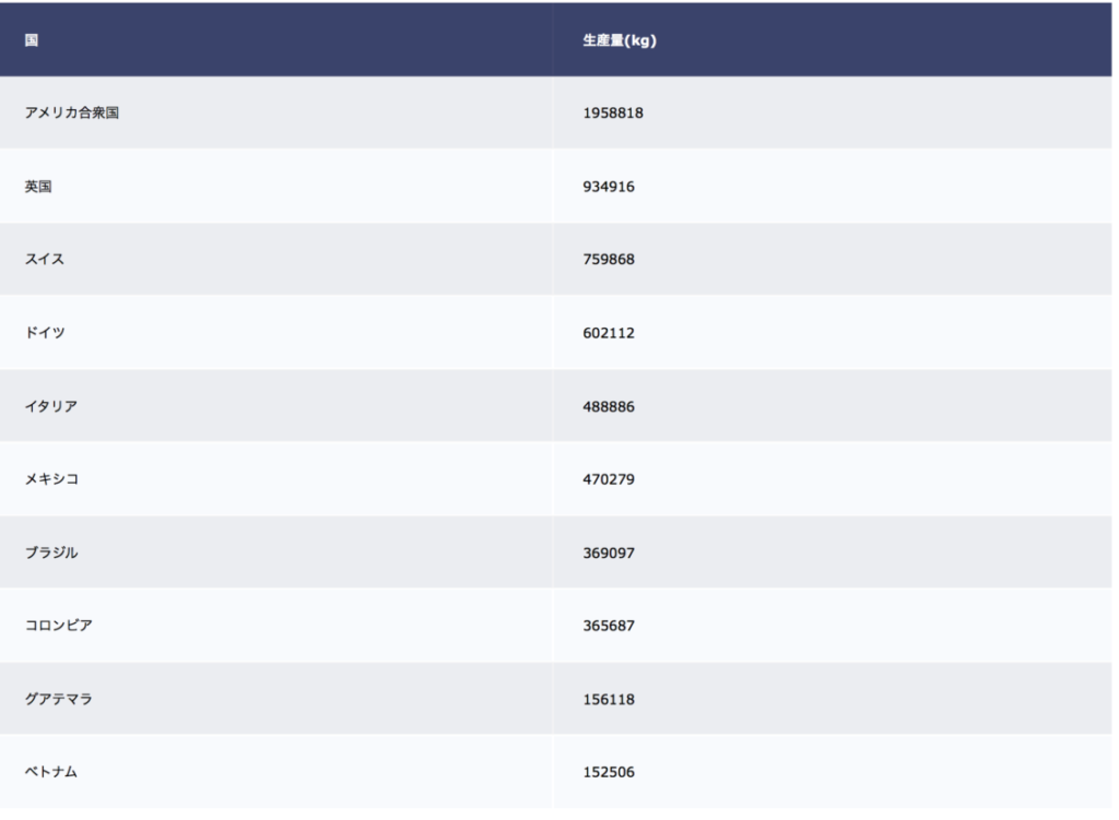
df.rename(columns = {'country':'国'}, inplace=True)
df.rename(columns = {'count':'生産量(kg)'}, inplace=True)
df.rename(columns = {'money':'金額(千円)'}, inplace=True)
fig = ff.create_table(df[0:10], height_constant=60)
fig.add_traces([trace1])
# initialize xaxis2 and yaxis2
fig['layout']['xaxis2'] = {}
fig['layout']['yaxis2'] = {}
# Edit layout for subplots
fig.layout.xaxis.update({'domain': [0, .5]})
fig.layout.xaxis2.update({'domain': [0.6, 1.]})
# The graph's yaxis MUST BE anchored to the graph's xaxis
fig.layout.yaxis2.update({'anchor': 'x2'})
fig.layout.yaxis2.update({'title': '金額(千円)'})
# Update the margins to add a title and see graph x-labels.
fig.layout.margin.update({'t':50, 'b':100})
fig.layout.update({'title': '2019年 焙煎豆輸入金額'})
fig.show()